Shazam Mobile App Redesign
Research indicates that Shazam’s users identify a song but then immediately bounce to a different app. This redesign keeps users engaged in Shazam by meeting their need for unique new music recommendations.
Project Overview
The Brief
Design new features on the Shazam mobile app to increase the time users spend on Shazam.
This project is not affiliated with Shazam. The following work is a conceptual educational exercise to practice and refine UX Skills.
The Problem
The most common use case of Shazam lasts less than half a minute. Shazam would now like to solve the problem by providing services to help connect users and their music.
The Solution
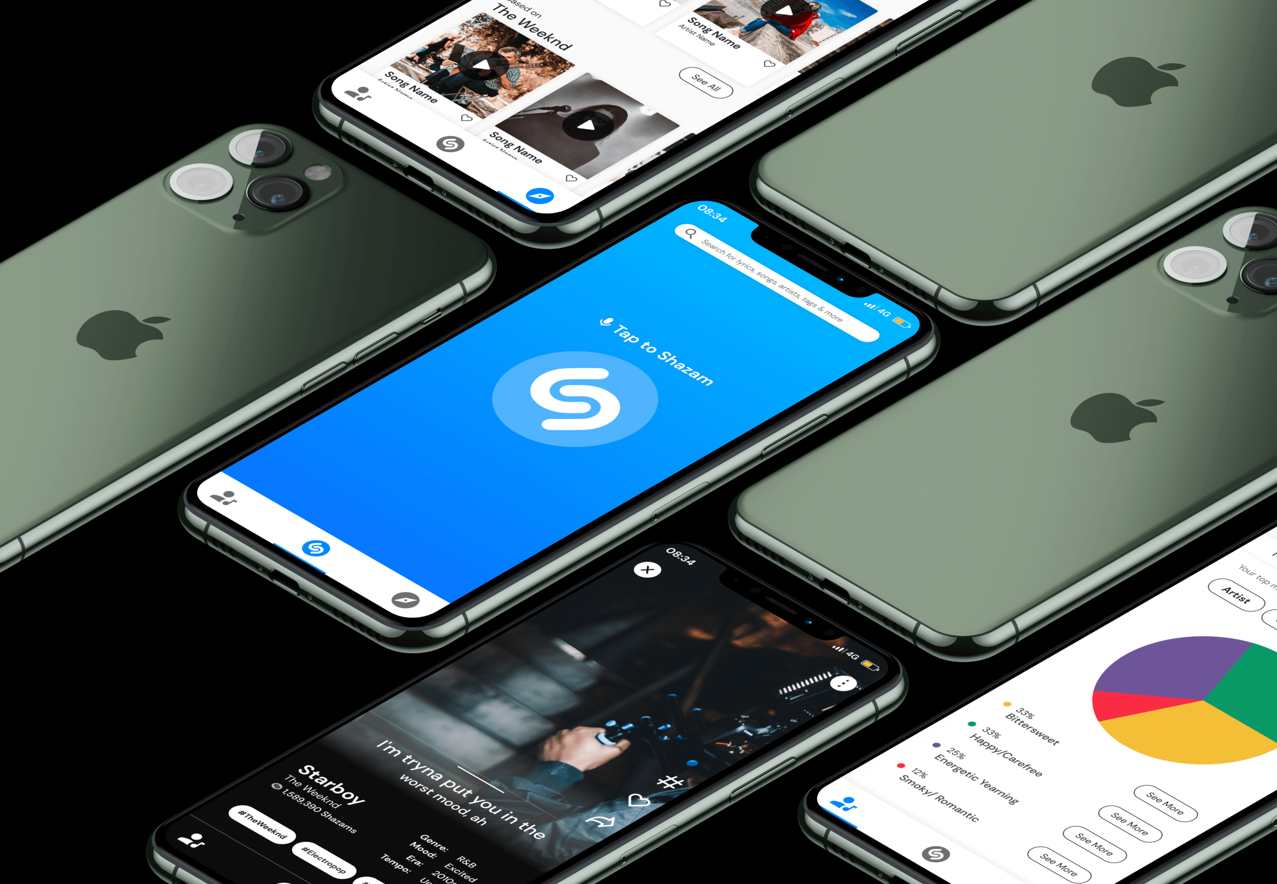
Create features in the mobile app that help users discover new music based on their music tastes. These features include a My Music Taste page, a Discovery page, a hashtag feature, and a swipe up feature to easily show users new music related to the song they initially tagged on Shazam.
The Details
UX Team: Stephanie Miller, Jenny Lam, Lesha Gajjar
My Role: User Research, Persona creation, User Journey Map, Comparative & Competitive Analysis, Site-mapping, User Flow, Wireframing, High Fidelity Prototype
Timeline: 4 weeks
Tools: Figma
Platform: Mobile App
The UX Process

1. Discover
Research user needs & business goals.

2. Define
Synthesize research into personas & problem statements.

3. Design
Ideate solutions through sketches and build wireframes.

4. Deliver
Test solution and iterate on designs.
1. Discover
The Research
Shazam’s own research into their mobile app shows that users typically stay on the app for less than half a minute. This leads them to a very clear business goal:
Increase the time users spend on Shazam by providing a new, engaging service.
That means my research needed to uncover the current user experience surrounding discovering new music and identify any needs the user had that might become an opportunity for providing a new feature. Keeping that in mind, I created this research objective:
Understand how users discover, collect, and engage with new music, identifying any positive or negative experiences.
To accomplish this research objective, our team completed:
User Interviews
A Competitive & Comparative Analysis
User Interviews
To gather and screen users for research, I created a screener survey. The survey helped identify participants who enjoyed discovering new music. Our UX team then completed 6 in-depth user interviews with users who fit Shazam’s target customer in order to understand their current experience discovering, collecting, and engaging with new music.
Key Insights
We took the results of the user interviews and used affinity mapping to synthesize the results. Through the affinity mapping, I discovered these three key insights:
-
1. Short Use Case
Our research confirmed that users use Shazam or other music identifying apps for between less than a minute to 3 minutes.
-
2. Unique Recommendations
Users expressed a desire for more unique recommendations for new songs from their music app that went beyond popular music.
-
3. Playlist Themes
Users like to organize their playlists by mood, date added, or activity/event.
The following quote represents the main sentiment expressed by our users:
“I don’t want to limit my preference to an artist or genre. I want the music app to take all of that into account when suggesting music.”
— User 3, new music collector
Competitive & Comparative Analysis
After completing user interviews, our team reviewed the direct and indirect competitors of Shazam to understand what features would help engage users. Through the analysis, I found that Shazam already had comparative features to it’s direct competitors. Shazam also had partnerships with indirect competitors like Spotify that allowed users to listen to songs tagged on Shazam in their preferred music listening app.

Therefore we knew we needed to go beyond the features that were already present in the market when coming up with ideas that would keep users on the app for longer.
2. Define
User Persona
I synthesized the data we learned about Shazam’s users through our research by creating a user persona, Ashley. Ashley represents the behaviors, pain points, and goals of Shazam’s ideal user. We referred to this persona throughout the rest of the design process to continually empathize with the user and keep their needs in mind.

Defining the Problem
Through the user research and creation of the user persona a common problem emerged for Shazam users:
Users need to easily find unique song recommendations that aren’t limited by music genre because they feel like they are getting the same popular songs recommended to them from Shazam and other apps.
I then ideated several solutions statements and our team settled on this guiding questions for the design phase:
How might we make it easy for users to find unique new song recommendations based on patterns from songs that they have identified?
Mapping out the Navigation
Before sketching solutions, I created a site map for the app that laid out the bottom navigation bar. I knew from our user interviews and solutions statement that users wanted ways to receive unique song recommendations, so I needed to figure out how to organize the categories on the bottom navigation to make it easy to find those recommendations.
The three main buttons on the navigation are My Library, Shazam, and Discover. The My Library button would show users their tagged songs under My Shazams, and would show users the data about their tagged songs under My Music Taste. When clicking the Discover button, users would be brought to a page that gives them suggestions for new music based on their tagged songs.

Next, I needed to create a user flow showing the various paths a user can take to find a unique song recommendation. The flow shows how the user can find a new song recommendation through any of the bottom navigation categories.
3. Design
Sketching Solutions
Using the user flow as a structure, our team each sketched several iterations of the screens for the app that were needed to help users find new song recommendations. Our first iterations for the Discover page are shown below (my sketch is on the left).

Our team agreed that we liked the search bar and the bottom navigation to help users easily browse for songs. We also liked the hashtag feature for helping connect users to unique song tags.
I then combined these features into the final sketch below.

Discover Page
Search bar for easy browsing
Users can toggle between different categories like artist, mood, etc.
Recommendations based on the user’s Shazams
To view all iterations of the Discovery Page, Tagged Song Page, and My Music Page, click below.
Wireframing
From the sketches that best fit user needs, our team created digital wireframes. The following flows demonstrate the different ways that users can get unique new song recommendations based on their tagged songs in Shazam.
Flow 1: Tagging a Song
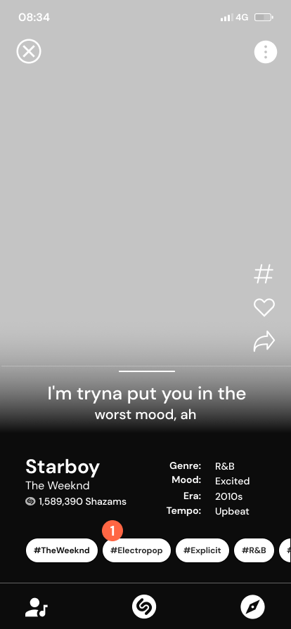
These screens show the flow of how users tag a song.
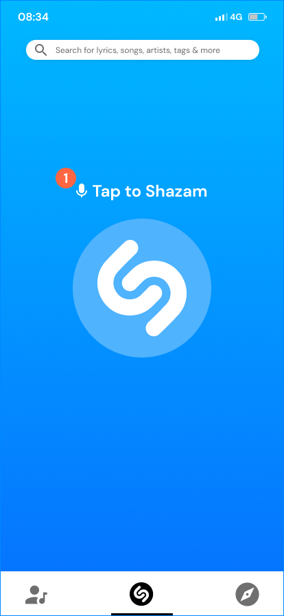
1. The user starts by tapping on the screen to Shazam a song

2. The user can view information about the song, like the mood of the song (user interviews found that users liked to categorize songs by mood, genre, time period, etc)
3. By dragging this bar up, the user can view more lyrics

4. The lyrics appear when the user drags the bar up
5. Users can like a song by clicking on the heart
Flow 2: Swiping Up
This flow shows how users can swipe up to the next related song, like in TikTok or Instagram Reels.

When the user swipes up, a small snippet of the next recommended song would automatically play. This swipe up feature would keep users curious and engaged in the app, swiping through the feed to hear the next song…and the next.
Flow 3: Creating Hashtags
Our research found that users wanted very specific song recommendations that went beyond the top 40 hits. To give users unique recommendations, we came up with the idea of allowing users to tag songs with words or phrases that capture the song.
(This was inspired by the very specific but popular #runninglatetotheball tag on TikTok where users posted videos of themselves going on runs to dramatic classical music, all while pretending to run late to a ball. The tag was so beloved that many users created “Running Late to the Ball” playlists on Spotify.)

1. Users click on the hashtag icon to start a new tag

2. Users can choose from popular tags that have already been associated with the song to show their agreement and give that tag more popularity

3. Users can also type their own unique hashtags that they think best fit the song
Flow 4: Viewing Hashtags
This flow shows how users can discover new songs by clicking on the hashtags other users have given a song.
1. Users can click on a hashtag to view songs related to that tag, in this case #Electropop

2. Users are brought to a Discover Page that shows them recommended songs based on the tag #Electropop
Flow 5: The “My Library” Page
This flow shows how users can view data on their music tagging habits and get new song recommendations based on that data.

1. Users can navigate to the “My Library” page from the bottom nav
2. Users can click on the “My Shazams” tab to view the songs they have tagged and liked in the past
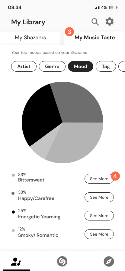
3. Users can click on the “My Music Taste” tab to view a pie chart summary of all the songs in their “My Library” section by category (like artist, genres, mood, etc.)
4. Users can click “See More” to view song recommendations

5. After clicking on “See More”, users are brought to the page showing related songs
Flow 6: The “Discover” Page
This flow shows how users can browse for new songs based on their Shazams.

1. Users can navigate to the “Discover” page from the bottom nav
2. A subtitle lets users know how these recommendations were put together

3. Users can toggle between categories (mood is shown here)
4. Users can click “See All” to view all recommended songs for the mood “Bittersweet”

5. Users are shown song recommendations based on the mood “Bittersweet”
6. Users can press the play button to be taken to the screen that shows the details for the song and plays a small snippet of the song
Prototyping
I then compiled the digital wireframes into a prototype, which focused on the various paths a user could take to find a unique new song recommendation. (The clickable high-fidelity prototype can be found at the end of the case study.)
4. Deliver
Usability Testing
To test our designs and see if they enabled the user to solve their problem of finding a unique new song recommendation, we conducted usability testing with the prototype and 4 users.
Quantitative Results
Qualitative Results
Users gave feedback that they enjoyed discovering the new music recommendations. One user said:
“It’s always kind of fun to look at what you’ve listened to the most, so I think the pie chart is pretty fun too.”
Changes and the Final Iteration
Based on the results of the usability testing, I made the following changes to the high fidelity prototype:
1. I added an onboarding process to introduce users to the swipe up feature.

>

2. I edited the language on the My Music Taste and Discover pages to add clarity.
3. I added white lines between colors on the pie chart and the percentages next to the colors to make the visual more accessible.

>

4. I edited a card to show what would happen to long song and artist names.
5. I added a quick like feature to the Discover page.

>

Final Iteration
The final iteration of the Shazam app allows users to easily find new music recommendations that are specific to their music taste. (For the best viewing experience, expand the below prototype by clicking on the enter full screen icon on the top right.)
Next Steps
Since users were able to find new song recommendations during usability testing, the next steps would be to add quick play features to the app, as users said that they would like to preview songs while staying on the Discover page to easily continue exploring.
-
1. Quick Play Feature
Add a quick play feature from the Discover page so users can hear a song without leaving the Discover page.
-
2. Quick Play Bar
Add a bar at the bottom of the screen for when the user is quick playing a song. This would allow the user to see the song playing and pause as needed.
-
3. Round 2 of Usability Testing
After adding the quick play features, I would conduct another round of usability testing to see how those and the previous changes would affect the user experience.