The Game Chest Website Redesign
The Game Chest’s tabletop gaming store is a success in their local community. My redesign brings the magic of finding the perfect game to their new website.

Project Overview
The Brief
Redesign the ecommerce website of The Game Chest to increase completed online purchases.
This project is not affiliated with The Game Chest. The following work is a conceptual educational exercise to practice and refine UX Skills.
The Problem
The Game Chest’s difficult to navigate website experience has negatively affected their online sales. They would now like to solve the problem by creating a streamlined experience for their customers to discover and purchase games.
The Solution
Create a clearer navigational and filtering experience for The Game Chest’s ideal customer.
The Details
UX Team: Stephanie Miller
My Role: User Research, Persona Creation, User Journey Map, Comparative & Competitive Analysis, Site-mapping, Card Sorting, User Flow, Wireframing, Medium Fidelity Prototype
Timeline: 4 weeks
Tools: Figma
Platform: Website
The UX Process

1. Discover
Research user needs & business goals.

2. Define
Synthesize research into personas & problem statements.

3. Design
Ideate solutions through sketches and build wireframes.

4. Deliver
Test solution and iterate on designs.
1. Discover
Digging into the Research
To begin tackling the goal of increasing the number of completed purchases on The Game Chest’s website, I needed to understand the current user experience. I started my research with this objective in mind:
Understand how tabletop game enthusiasts currently find and choose new games to buy, identifying any positive and negative experiences.
To accomplish this research objective, I used three tools:
User Interviews
Usability Testing
Competitive & Comparative Analysis

User Interviews
First, I created a screener survey to identify participants for research who frequently played board games and had purchased a board game in the past year. I completed 5 in-depth user interviews with users who fit The Game Chest’s target customer in order to understand their current experience finding and purchasing games.
Key Insights
I took the results of the user interviews and used affinity mapping to synthesize the results. Through the affinity mapping, I discovered these three key insights:
-
1. Overwhelmed by choices
Users had difficulty finding a game that fit their exact needs due to an overwhelming amount of choices.
-
2. Utilizing Workarounds
To navigate the overwhelming options, users bought games they had played before, asked friends or store staff members for recommendations, and read reviews online.
-
3. Specific Criteria
Users were intentional about the games they bought and chose games based on the type of game, the number of players, the difficulty to learn, and the time to play.
Usability Testing
To further understand the experience of users on the current website, I conducted 5 usability tests. While users completed tasks based around areas of the website such as the home page, the contact us page, and the checkout process, one significant result emerged:
Only ⅗ of users were able to find a game they would like to purchase on The Game Chest’s website.
The two users who were not able to find a game gave up. Of the three successful users, two were successful because they saw a game right away that they recognized and purchased that one instead of trying to find a better suited game.
One user said of their experience:
“I’m close to the point, where if I didn’t know this was my local game store, I would be done with this website experience.”
— User 2, board game enthusiast
Competitive & Comparative Analysis
Now that I had gathered research on the current user experience, the next step was to understand what features competitors in the tabletop game industry, and indirect competitors, offered to create a positive experience for users.
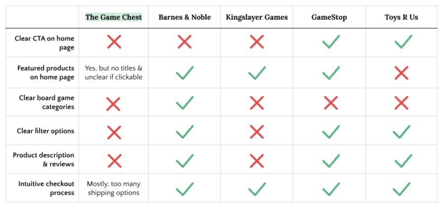
Some features that were present on competitors’ sites that were not as present on The Game Chest’s site were:
Clear call to actions on the home page
Featured products on the home page that were clearly labeled
An easily identifiable filter feature that allowed users to sort product results
A product page that featured detailed game descriptions and products reviews
2. Define
User Persona
I synthesized the data I learned about The Game Chest’s users through my research by creating a user persona, David. David represents the behaviors, pain points, and goals of The Game Chest’s ideal user. I referred to this persona throughout the rest of the design process to continually empathize with the user and keep their needs in mind.
User Journey Map
I also created a User Journey Map for David to demonstrate his journey through the game buying process. David’s lowest point in his journey happens during the decision making process, as he feels overwhelmed with options.
This journey map highlighted that the user’s biggest pain point happens when trying to sift through all the tabletop game choices. They feel overwhelmed and their enthusiasm dips. Understanding this helped me narrow in on the most important pain point for The Game Chest’s users.
Defining the Problem
The user research, creation of the user persona, and development of the user journey map started to paint a clear picture of the problem The Game Chest’s users were facing:
Users were experiencing an overwhelming amount of choices that led them to either abandon their search or settle for a game they have played before. These users needed a way to easily find and purchase new tabletop games that fit their preferred style of play.
Based on this problem statement, the next phase of the design process had me considering:
How might I create a solution that makes it easy for users to find games that fit their preferred style of play?
Creating a Streamlined Navigation
The first area to tackle before diving into sketching solutions was to figure out the site map for the website. I knew from my usability testing that users had difficulty navigating The Game Chest’s website, so I needed to figure out how to organize the categories on the homepage to make them clear to users.
To do this I created an open card sort, where participants grouped together the toy and game category labels into larger categories that made sense to them. Through this card sort, I learned that there were some clear groupings for users: Games, Puzzles, Arts & Crafts, and Toys. I created the below site map using these results.
Next, I needed to create a user flow through the website that users could take to discover and purchase new tabletop games. In the flow, I emphasized the clear hierarchy of board game categories defined in the site map and thought about how filtering results would impact the user flow.
3. Design
Sketching Solutions
Using the user flow as a structure, I sketched multiple solutions for each page of the website that contributed to the user’s experience of discovering and deciding on a game to purchase. One version of the home page is below.
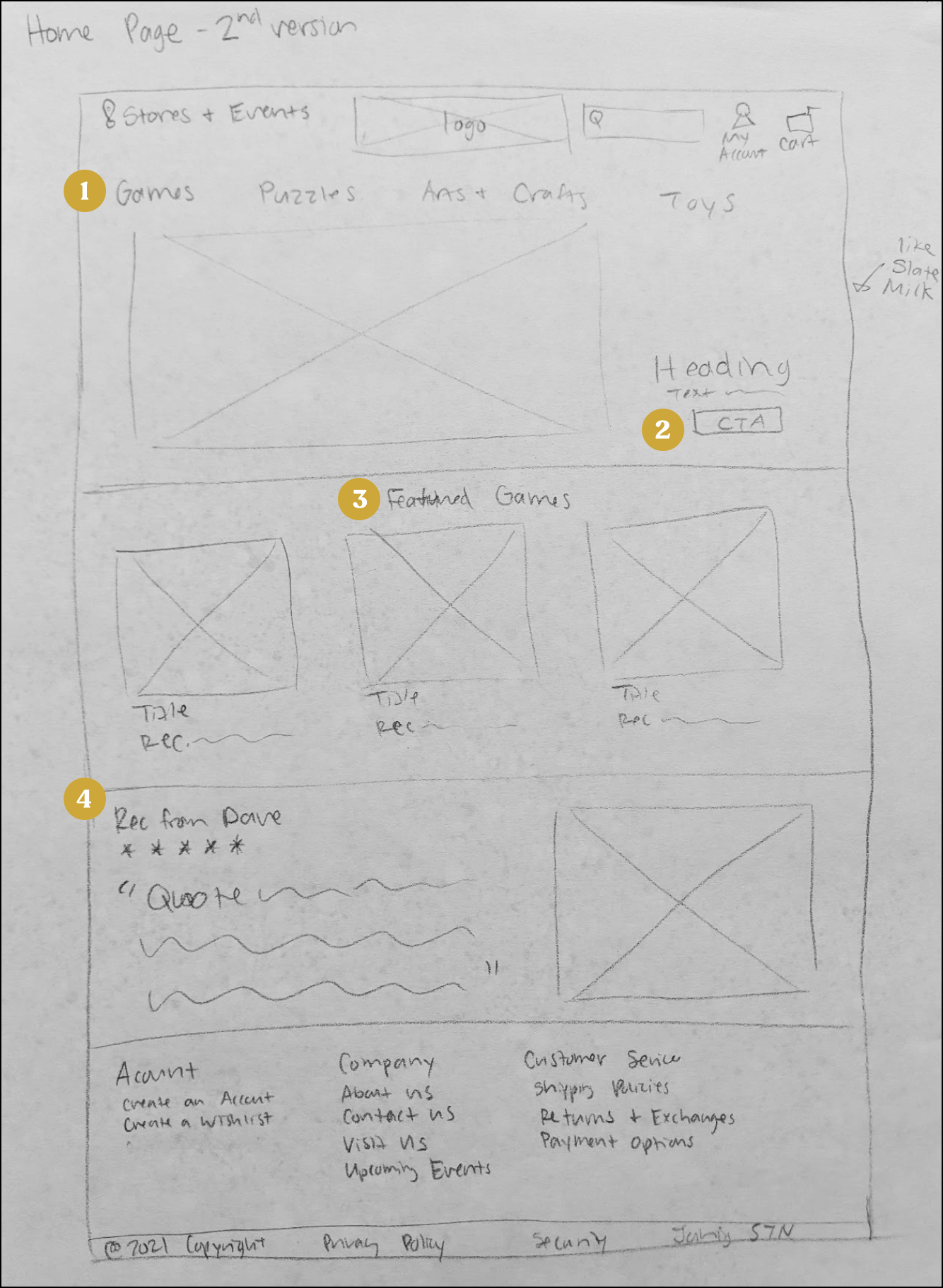
Home Page
Easy to find global navigation with clear categories
Clear call to action
Featured products section to help users find interesting games
Staff picks to meet the user’s desire for game recommendations
To view all iterations of the home page, category pages, and product pages, click below.
Wireframing
From my multiple ideations, I picked the version that best fit the users needs and created digital wireframes.
Homepage
Streamlined global navigation
Clear call to action

4. Staff recommendation to help users find interesting games

3. Featured games on the homepage now clearly titled
Category Page

Filter now clearly visible and identifiable
Sub-category headings available to help users find specific types of games
Product Page

Reviews are shown on the product page
Detailed product description available for every product
Prototyping
I then compiled the digital wireframes into a medium fidelity prototype, which focused on the interaction of the user with the navigation and filtering systems built. (The clickable high-fidelity prototype can be found at the end of the case study.)
4. Deliver
Usability Testing
To test my designs and see if they enabled the user to solve their problem of finding a game to buy that fit their preferences, I conducted usability testing with the mid-fidelity prototype. I gave the 5 users I recruited the following task:
You want to buy a new board game that you can play with your partner on game night. You two enjoy strategy board games. Show me how you would find a new 2-player strategy board game to purchase.
To be successful at this task, I wanted my users to complete the task in under 5 minutes with 1 or fewer errors.
Quantitative Results
Qualitative Results
Users gave feedback that the website was clean, clear, and easy to use overall. However, there were a few issues users commented on:
-
Images & Titles
Users were disappointed by the prototype’s lack of real images and game titles. They wanted those features to feel immersed in the website.
-
Dropdown Menu
One user experienced confusion with the dropdown menu. Clicking on the menu took them to a page they were not expecting.
“I was a little stunned to go immediately to the product page.” - User 3
-
Breadcrumbs Navigation
The breadcrumbs navigation during the checkout process wasn’t clear.
Changes and the Final Iteration
Based on the results of the usability testing, I made the following changes to the high fidelity prototype:
1. I added visuals like the hero image and product photos (and made final color and typography edits).


2. I clarified the hierarchy in the dropdown menus to make categories more clear to users.
3. I clarified the checkout breadcrumbs by using color to indicate which part of the process users were on.

Final Iteration
The final iteration of The Game Chest’s website allows users to easily find and purchase a game that fits their preferred style of game play. (For the best viewing experience, expand the below prototype by clicking on the enter full screen icon on the top right.)
Next Steps
Since users were able to find a choose a game to purchase, the next steps would be to refine the checkout process. After making the below design changes, I would then conduct another round of usability testing to see how those changes affected the user experience.
-
1. Refine Add to Cart
Create a side pop-up for the Add to Cart feature so the users isn’t brought directly to the cart and can keep shopping.
-
2. Improve the Layout of the Cart Page
Improve the layout of the cart page to be more clear to the user.
-
3. Reduce Checkout Pages
Reduce the number of pages needed for the checkout process.