Citruslabs Volunteer Portal Redesign
Citruslabs is a technology company that helps businesses run clinical trials. This redesign of the Citruslabs’ volunteer portal helps users complete clinical trials without a hitch and reduces the labor of the business.

Project Overview
The Brief
Redesign the volunteer portal of Citruslabs to increase clinical trial completion rates and reduce labor of the Citruslabs staff.
This project was completed pro-bono for Citruslabs.
The Problem
The current Citruslabs volunteer portal lacks the functionality needed to guide volunteers through the clinical trial process, so it is currently not in use.
Citruslabs would now like to redesign their volunteer portal to guide users through the process and reduce labor for their customer service staff.
The Solution
Create a volunteer portal that clearly communicates to volunteers the steps to complete a clinical trial, which will reduce dropout rates and help the business reduce labor.
The Details
UX Team: Stephanie Miller, Diana DeFelice-Pirro, Shawntay Kent
My Role: User Research, Persona Creation, User Journey Map, Task Flows, Sketching, Wireframing, Style Guide Creation, High Fidelity Prototyping, Usability Testing, Client Meetings & Presentation
Timeline: 6 weeks
Tools: Figma
Platform: Website Application
The UX Process

1. Discover
Research user needs & business goals.

2. Define
Synthesize research into personas & problem statements.

3. Design
Ideate solutions through sketches and build wireframes.

4. Deliver
Test solution and iterate on designs.
1. Discover
The Research
Our team spoke with stakeholders at Citruslabs to understand their business goals. I discovered three business goals that Citruslaslabs wanted their volunteer portal to address:
Completion: Increase the user completion rate of clinical trials.
Retention: Increase the engagement for users who have not been matched to a trial yet.
Communication: Reduce the manual communication of the Citruslabs customer service manager.
I then started my user research with this objective in mind:
Understand the user experience of participating in a clinical trial, from recruitment through trial completion, identifying any pain points.
To accomplish this research objective, our team completed user interviews.

User Interviews
First, I connected with current volunteers at Citruslabs to recruit users for interviews. We completed 5 in-depth user interviews with those users in order to understand their current experience of participating in clinical research trials.
Key Insights
I took the results of the user interviews and used affinity mapping to synthesize the results. Through the affinity mapping, I discovered these three key insights:
-
1. Know All the Steps
Users relied on texts and emails from Citruslabs to know the next step in the trial. They would like to be able to view all the steps of the trial in one place.
-
2. Quality Communication
Even though users were reliant on communication from Citruslabs to complete the trials, they also felt like Citruslabs was very responsive in their communication.
-
3. Qualifying for Trials
Users were frustrated when they did not receive any feedback about why they didn’t qualify for a trial. They often spent significant time on questionnaires and then didn’t qualify.
One user said of their experience:
“I currently depend on email or my own notes to figure out what I need to do next in the trial. I’d like a place to track the steps of the study.”
— User 4, Citruslabs volunteer
2. Define
User Persona
I synthesized the data I learned about Citruslabs users through my research by creating a user persona, Leslie. Leslie represents the frustrations, motivations, and needs of Citruslabs’ ideal user. I referred to this persona throughout the rest of the process to continually empathize with the user and let their needs guide my design decisions.

User Journey Map
To demonstrate Leslie’s journey through the clinical trial experience, I created this user journey map. This map also shows the areas of opportunity related to that moment in the user journey. For example, at Leslie’s lowest point where she is frustrated that she didn’t qualify for a trial and doesn’t understand why, there is an opportunity to improve the user experience by providing rationale about why she did not qualify.
Defining the Problem
The user research, creation of the user persona, and development of the user journey map started to paint a clear picture of the problem Citruslabs users were facing, so I created this problem statement:
Users currently rely on one-to-one communication with Citruslabs to be guided through the research trial process. There’s an opportunity to create a portal that clearly communicates to volunteers the steps to complete a clinical trial. This solution should reduce dropout rates and increase re-enrollment rates, while at the same time helping the business reduce labor.
Based on this problem statement, I came up with this solution statement:
How might we create a portal that clearly communicates to volunteers the steps to complete a clinical trial?
The solution would also need to consider these areas:
Steps: Users need to track their process in the clinical trial and be reminded of next steps.
Surveys: Users need to be shown more trials they may qualify for to keep them engaged in the portal and be informed about why they did not qualify for a trial.
Communication: Users need to still be able to easily contact Citruslabs while reducing 1 to 1 communication on the part of Citruslabs.
Creating Streamlined Task Flows
With the solution statement ready, the next step was to create task flows that solved the user’s main problems. I mapped out three task flows to show how the user would complete tasks related to completing a next step in their clinical trial, qualifying for a new clinical trial, and communicating with Citruslabs.

3. Design
Sketching Solutions
I knew that the homescreen of the portal needed to have the three main tasks users needed to complete depending on their stage in the trial. That way when users opened the portal, it would be easy for them to complete one of the three desired tasks:
Completing a to-do
Qualifying for a new trial through taking a survey
Sending a message to Citruslabs.
Our team each sketched several iterations of homepage (my sketch is on the left). We decided on using the screen I designed for our wireframes, as it allowed users to complete any of the three tasks from the homepage.
(my sketch)

(teammate 2’s sketch)

(teammate 3’s sketch)
Wireframing
Our team worked together to create the wireframes. I focused on the cards on the homepage and the survey flow while my teammates focused on the navigation, the notifications, the to-do page, and the messages page.
Homepage
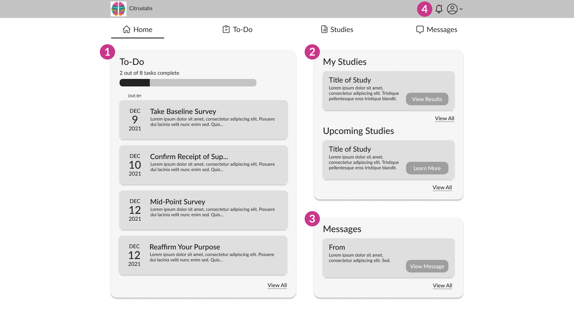
1. The To-Do card shows the user the next tasks they have to complete in their clinical trial.
2. The Studies card shows the user the results of studies they have tried to qualify for and showcases upcoming studies the user can try to qualify for.
3. The Messages card shows users any new messages they may have received from Citruslabs.
4. The notifications bell shows a red dot when the user has a new notification, like an upcoming to-do that needs completing.
To-Do Page
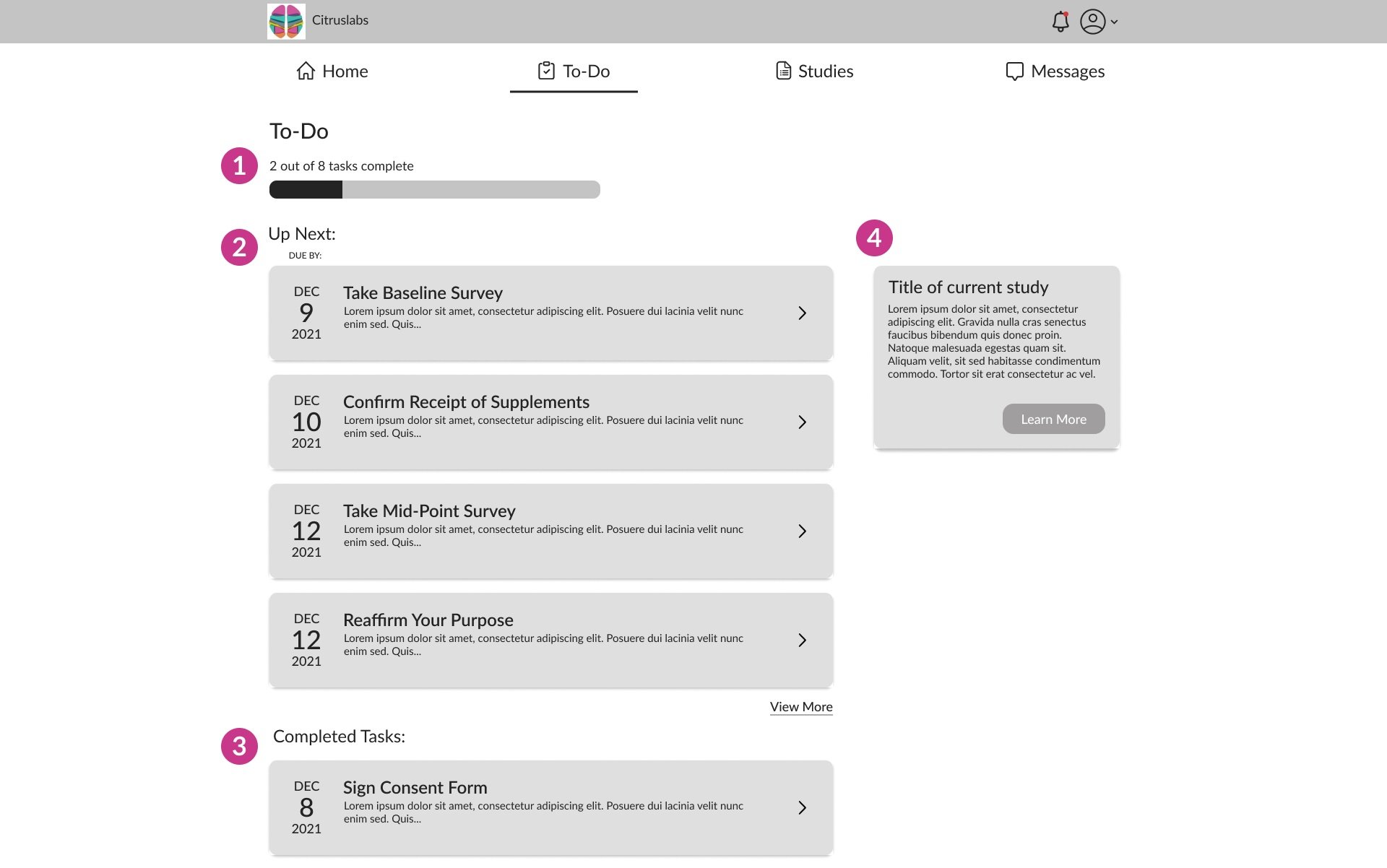
1. The task completed bar adds gamification to completing to-dos.
2. User can easily view the upcoming tasks in their trial and view the du by date.
3. Users can also see tasks they have already completed in the trial.
4. Users can always click on this card to view the study details.
Studies Page
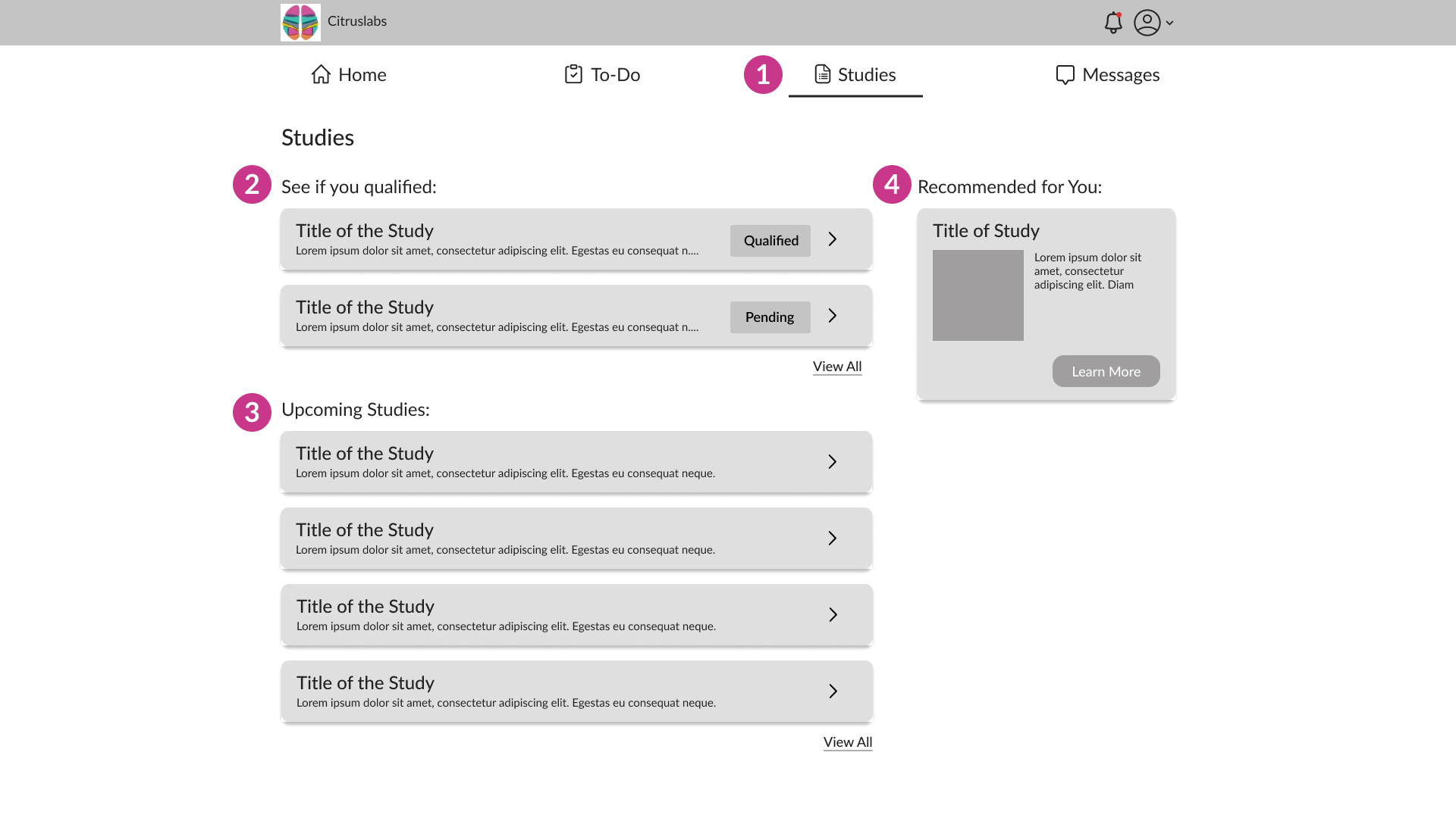
1. The top nav uses an underline to show the user what page they are on.
2. Here users can view the results of studies for which they have taken qualifying surveys. The user can view the rectangle on the right that shows them if they qualified, did not qualify, or if the results are pending.
3. Users can view upcoming clinical trials and then take a survey to see if they qualify.
4. This would show an upcoming trial that may fit the demographics of the user and encourage them to take the qualifying survey.
Messages Page

1. Uses can view messages in their inbox or toggle to other folders like Starred, Sent, and Deleted.
2. Users can star important messages to add them to their Starred folder.
3. Users can click the plus icon to create a new message to send to Citruslabs.
Prototyping
I then compiled the digital wireframes into a clickable prototype, which focused on the three task flows:
Completing the next to-do in the trial
Taking a survey to qualify to a new trial
Viewing a message from Citruslabs. (The clickable high-fidelity prototype can be found at the end of the case study
4. Deliver
Usability Testing
We completed usability testing with 5 users to test our designs and look for opportunities for improvement.
Quantitative Results
Priority Matrix
Our team then took the feedback from usability testing and prioritized the changes we should make based on impact and effort. The colored dots show the changes we did make while the grey dots show changes that were lower impact and high effort and were out of the scope of the project.

Changes and the Final Iteration
Based on the priority matrix, I made the following changes to the high fidelity prototype:
Homepage

1. Added the subtitle of the name of the study under the To-Do title to clarify this section.
2. Changed the layout of this card to put “Studies” as the header to match the top nav. Added a subtitle to further clarify the section.
To-Do Page

3. Edited the completed cards to differentiate them from the upcoming tasks (greyed out the text and added the check mark).
Messages Page

4. Differentiated the read from the unread messages by bolding the text, adding a darker grey background, and adding a red dot.
5. Added a dropdown for the send to portion of the message so users can easily choose from Citruslabs contacts to send a message.
Style Guide
For the high fidelity prototype, our team also made color and font choices that aligned with Citruslabs’ brand colors and fit accessibility standards.

Font
We chose the font Lato because it matched the Citruslabs website and fit the friendly vibe Citruslabs wanted to convey.
Colors
For the buttons, Citruslabs had wanted to use their bright teal color, but it did not pass accessibility standards. So we switched the color to a darker teal that met WCAG AA accessibility standards with white text and still fit their brand colors.
Final Iteration
The final iteration of the Citruslabs Volunteer Portal allows users to complete their next task in their clinical trial, take qualifying surveys for new trials and view their results, and easily message Citruslabs. (For the best viewing experience, expand the below prototype by clicking on the enter full screen icon on the top right.)
Next Steps
The next steps I would do for this project would be:
Conduct a second round of usability testing to see if the changes made to the prototype clarified the To-Do and Studies sections for users.
Build out the account page that is hinted at in this iteration with the account icon in the top right.